I love type and letterforms and I'm often inspired by the possibilities within typographic expression.
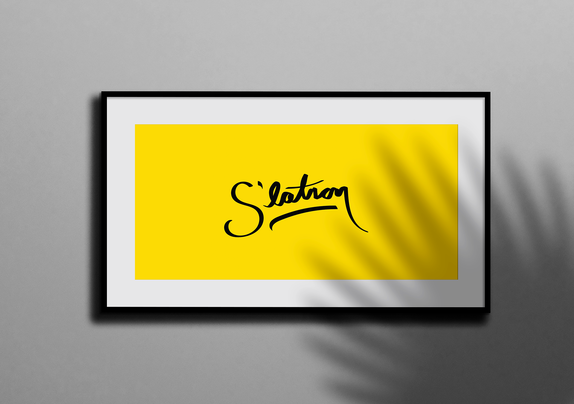
"S'latron" was an independently motivated project born through nostalgia. In the early 2000s, I would bother one of the bots on AIM, Smarterchild, whose signature line was "S'latron!", a slang term for "see you later on". It never caught on like brb or g2g but I sure remember it.
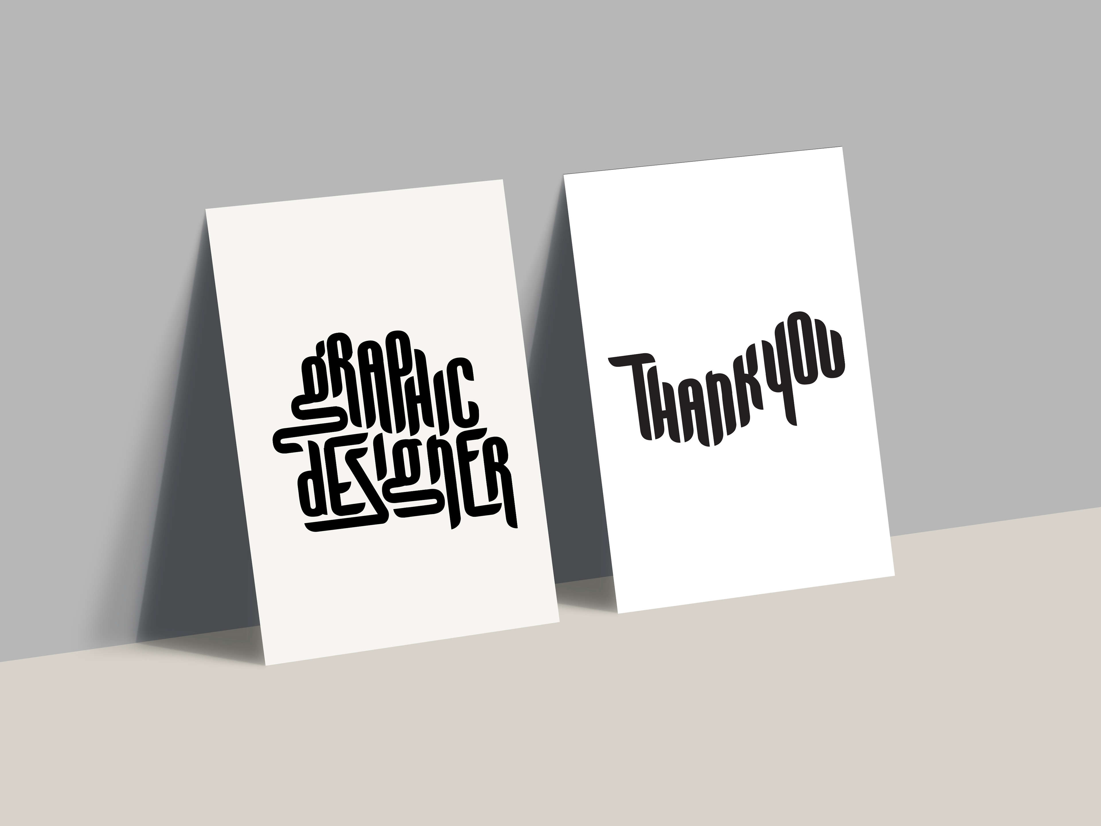
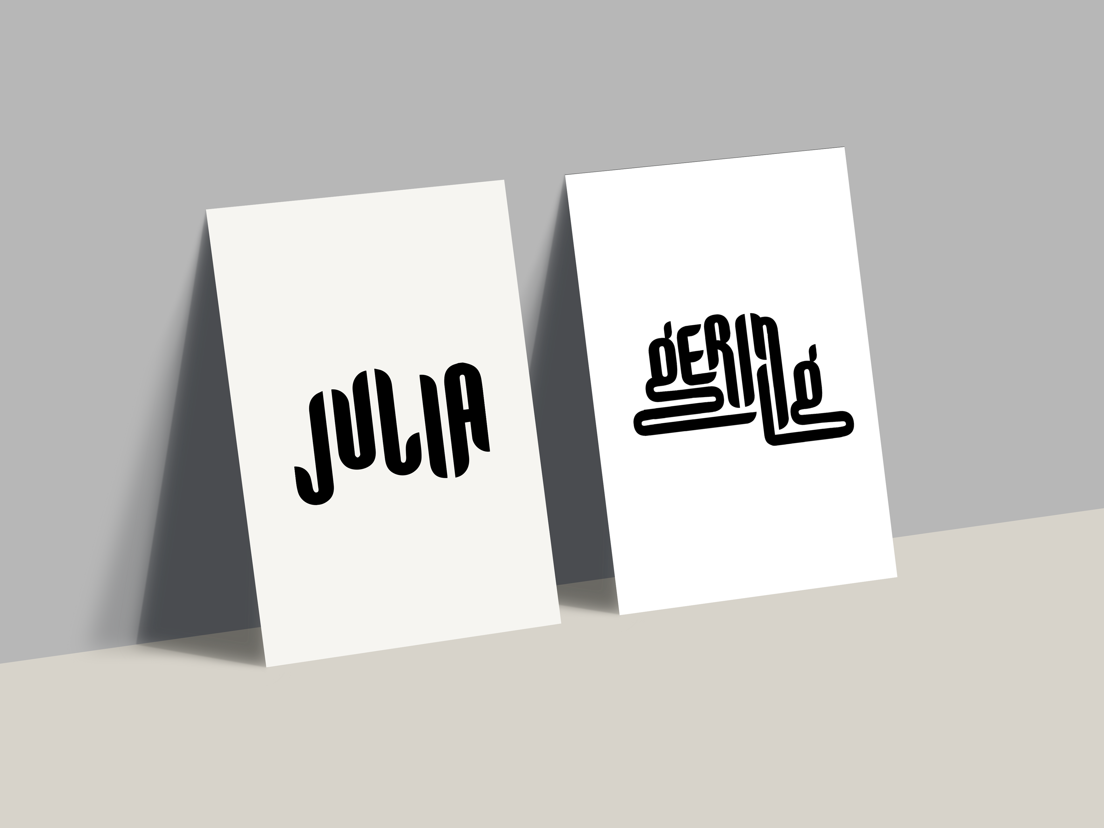
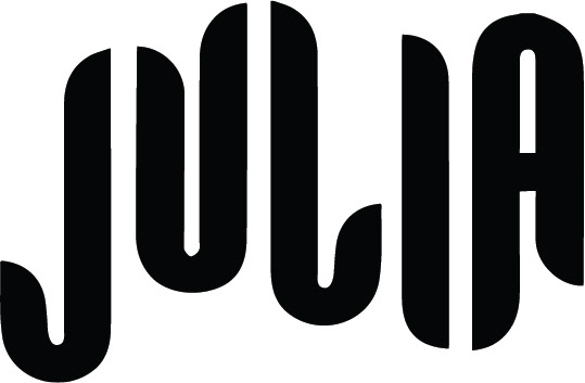
The posters above are manipulations of the typeface Balboa that I use as a self-branding typeface on both my website and business cards.
Art Director: Michelle Bowers
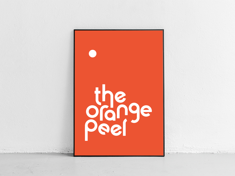
The orange peel type was created for an idea put on hold. The Orange Peel was a concept that aimed to bring together art students and professors for creatively motivated conversation.
Art Director: Michelle Bowers